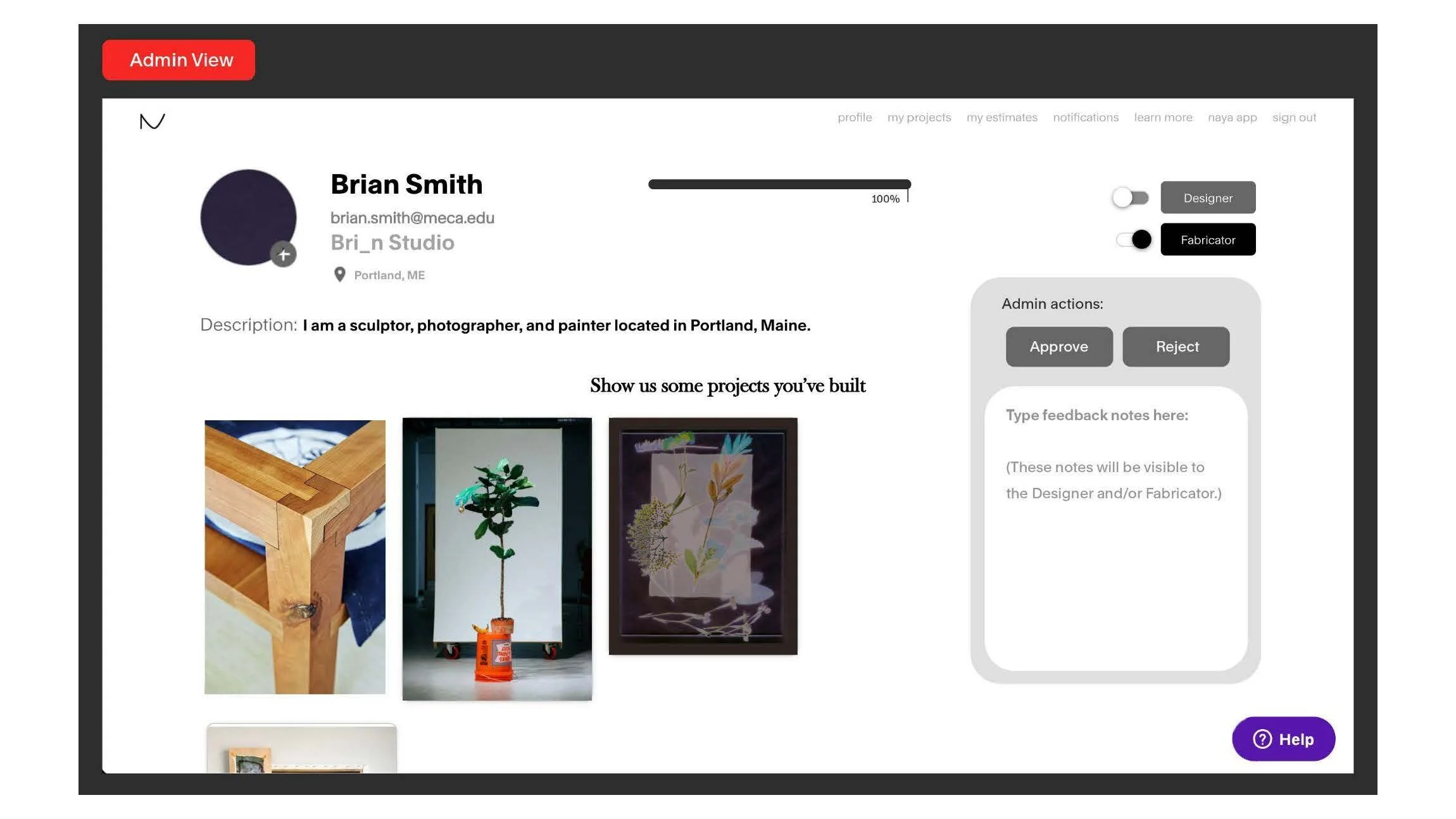
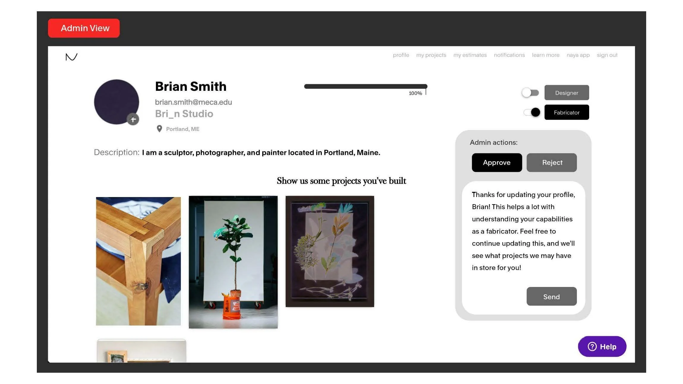
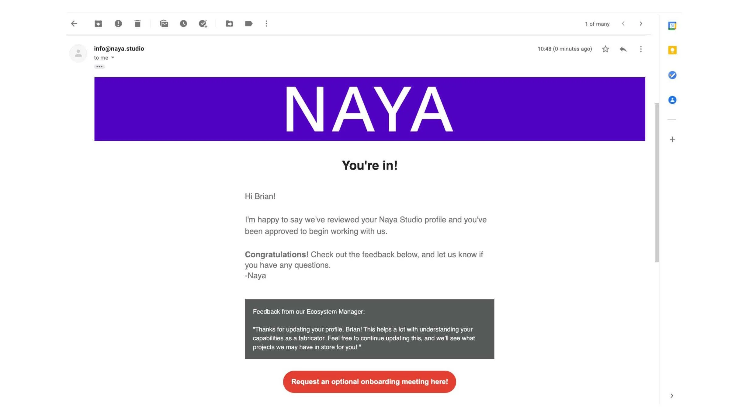
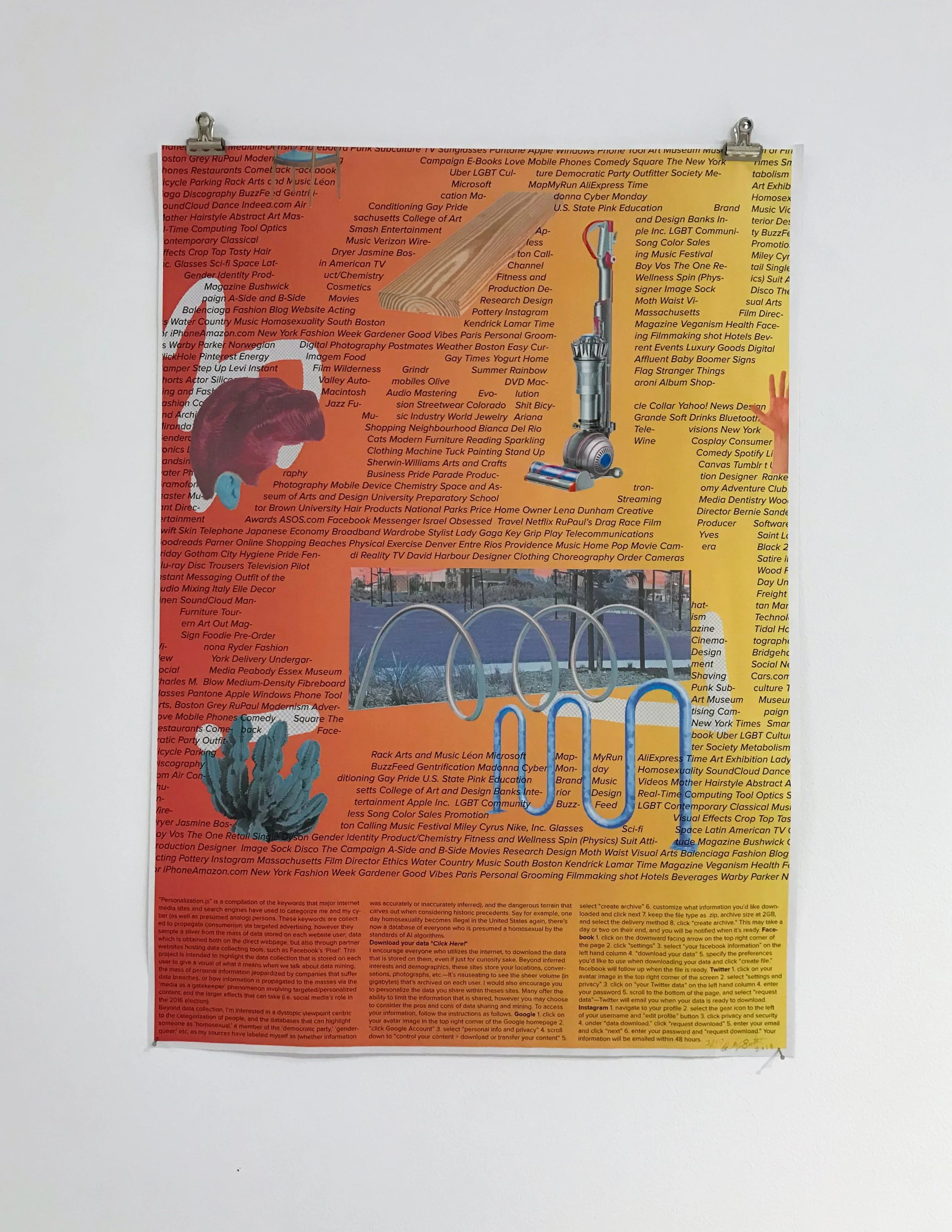
I have begun the process of turning my attention towards the mass of data collection that is being performed on internet users as they utilize social media websites, search engines, and other sites on the world wide web. Websites collect an array of information about each user to attempt to serve them better via targeted advertising, as well as data analytics. The function of data collection is centered around consumerism, and how to profit further from the viewers on the webpages, as well as the ads that showcase as you browse.
With all this in mind, I have downloaded my data from Facebook, Instagram, Snapchat, Twitter, and Google, and have focused my attention into a folder labeled “personalization.js” (it’s labeled this way on Twitter, but has corresponding folders within each of the other webpages data fields, just labeled differently). Personalization.js holds the keywords and inferred demographic descriptors of the profile user for the respective website. The words are disparate, confusing, funny, sometimes accurate, and altogether concerning. I’ve been randomizing the lists of words that are used to describe me from these websites, and creating works of art in a ‘surrealist parlour game’ mode of making within the confines of rigid parameters.
The reason I am doing this project is to showcase the mass of data that is stored on each user, but in reality I am using the smallest sliver of the information that is included with the gigabytes of data sent to me from these sites. Rather than looking at these words from Personalization.js as ways to tailor these websites to myself, I’m interested in looking at this information in a lens of labeling and categorizing humans within a database, and the foreboding nature that holds.
I wanted to provide space for a viewer to digest the idea of big data collection (as it’s fairly abstract), and provide information on how they can download their own data. With this, I would hope to demystify the seemingly random mixed media forms I have been working on, and present a call to action (or at least attention) from the viewer.
With that, I came up with the idea of a poster takeaway that would include all of my personalization.js words that are used to classify my inferred interests and demographics, whether accurate or not, as well as step by step instructions to download one’s individual data to create a physical visual of the mass of information that is stored on each person. I wanted to create a poster that was visually appealing and humorous, so-as to inspire one to hang it in their own space, therefore providing conscious or unconscious reminders to the poster owner to consider how data tracking influences them, and also to publicly share my personalization.js data, as a public display of a sliver of data that is compromised in the event of data breaches on these websites. I’ve editioned these prints out of 50 total, as this information is ever-changing and if I were to run out of takeaways, I would intend to reevaluate the personalization.js words and design of the poster; in this sense this project will have many forms.
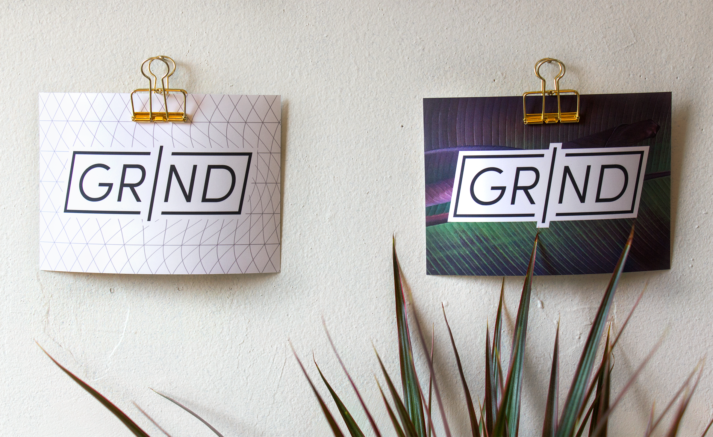
GR/ND Logo Design
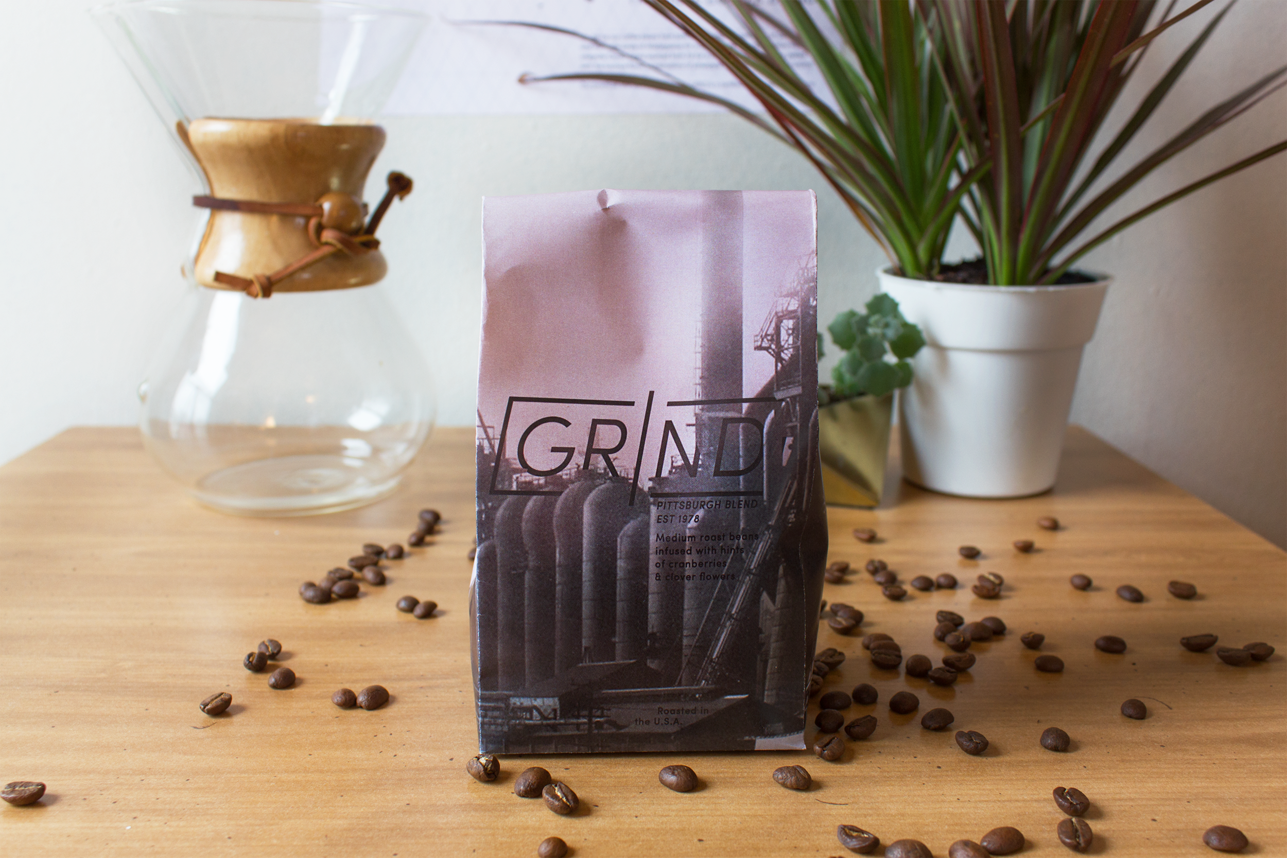
As an avid coffee drinker, I have always wanted to tackle the challenge of branding a coffee company! The first part of designing this brand was picking the location of the company, and after careful consideration the decision was that the headquarters would be based out of Pittsburgh, Pennsylvania. I looked into the history of the city more and decided that the design should be heavily influenced by the second industrial revolution: specifically in the steel mills, as they were numerous within Pittsburgh. This inspiration was displayed through simple, yet functional typography, and imagery with text integration.
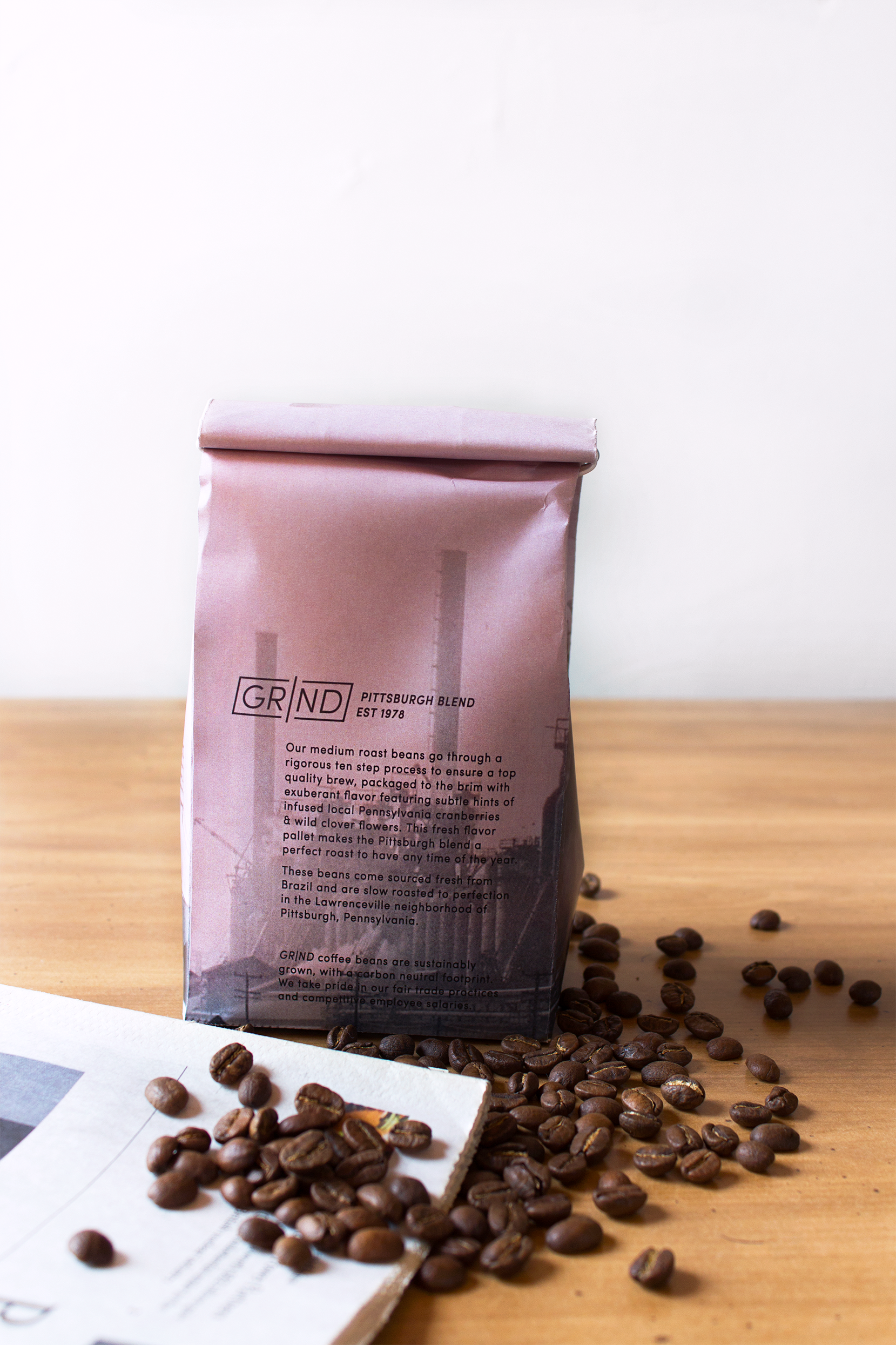
GR/ND Pittsburgh Blend Coffee Bag
The GR/ND Pittsburgh Blend Coffee Bags began with sourced historic imagery of the city’s steel mills. The vintage appeal of the industrial cityscape follows the aesthetic I am going for within this brand. I modified the image to enhance the smoke from the smokestacks and created the color scheme. The pink wash is reminiscent of the morning, and brings the flavor decisions (cranberries & clover) into the design. I masked parts of the logo behind the factory to create multiple planes that the text lives on, and to fully integrate it within the image.
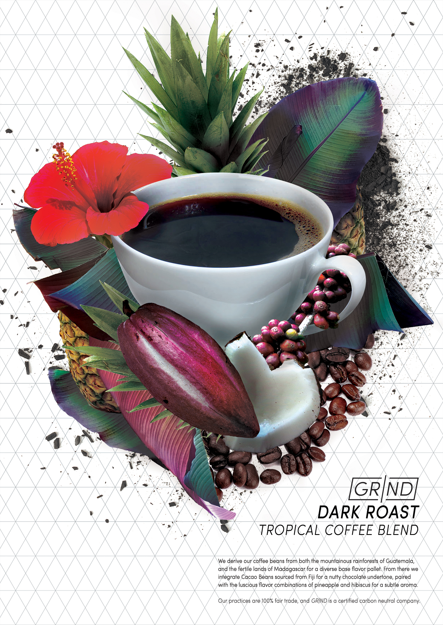
GR/ND Tropical Blend Poster
The Tropical Blend Poster was the first piece I made for this project. I utilized digital collage techniques to create an alluring visual to compliment the simple typography, and focused on tying it into the brand via colors, and the presence of charcoal dust, which is the fuel used in the steel industries historically.
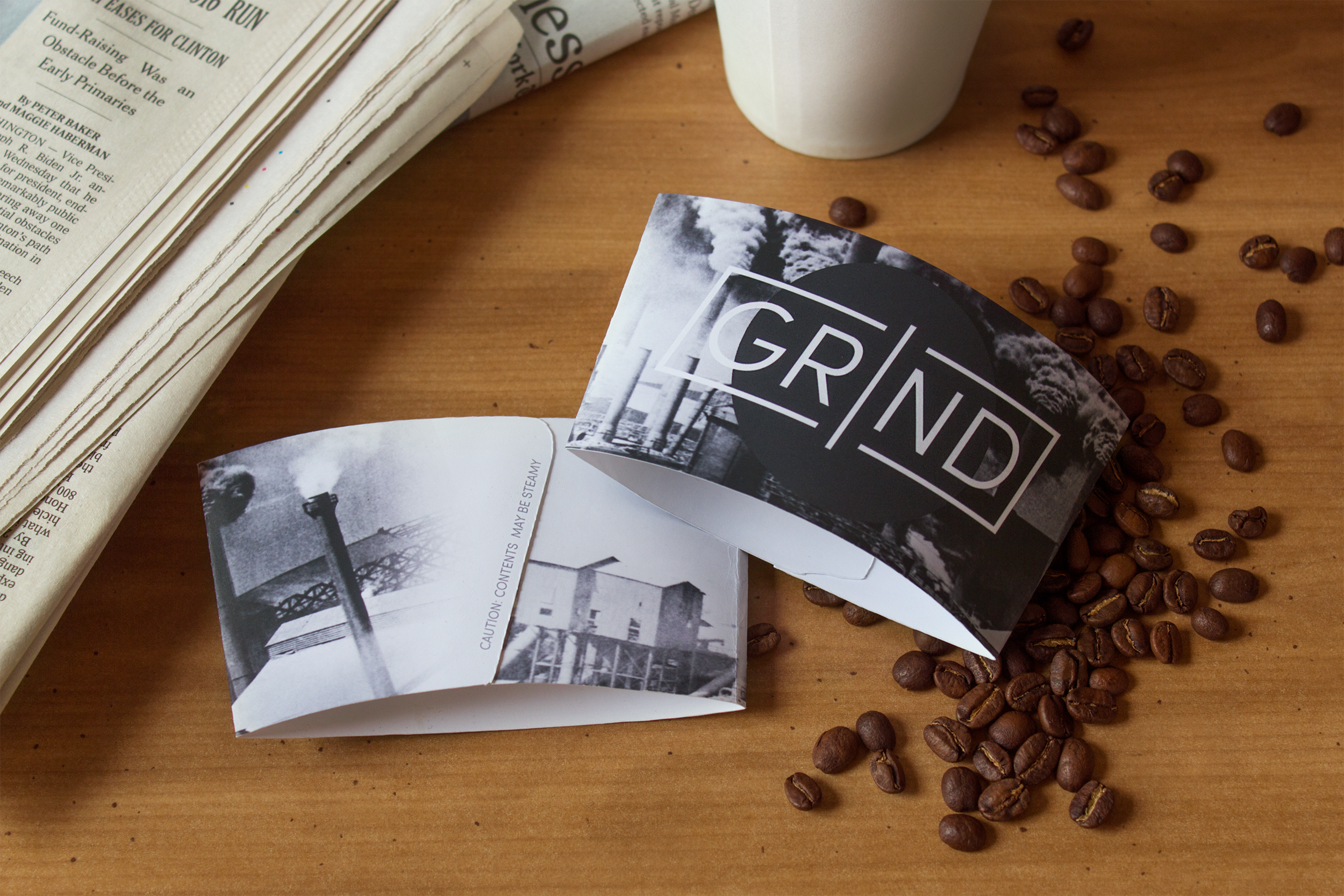
GR/ND Coffee Sleeve
Coffee Sleeves are interesting because they are a necessity that is often overlooked. As opposed to taking the common route of a muted boring brown paper sleeve, I focused my energy on fully designing that aspect, while leaving a minimal white cup. Similarly to how coasters become a collectible item, there is the same type of potential with coffee sleeves. I wanted to take the challenge of creating a sleeve worth “holding on to.”
GR/ND Stickers
Social persuasion and trends are the most powerful form of advertising. Many companies have jumped on my radar due to seeing their branded stickers around, therefore it was a no-brainer that stickers were a "must" in this brand package!
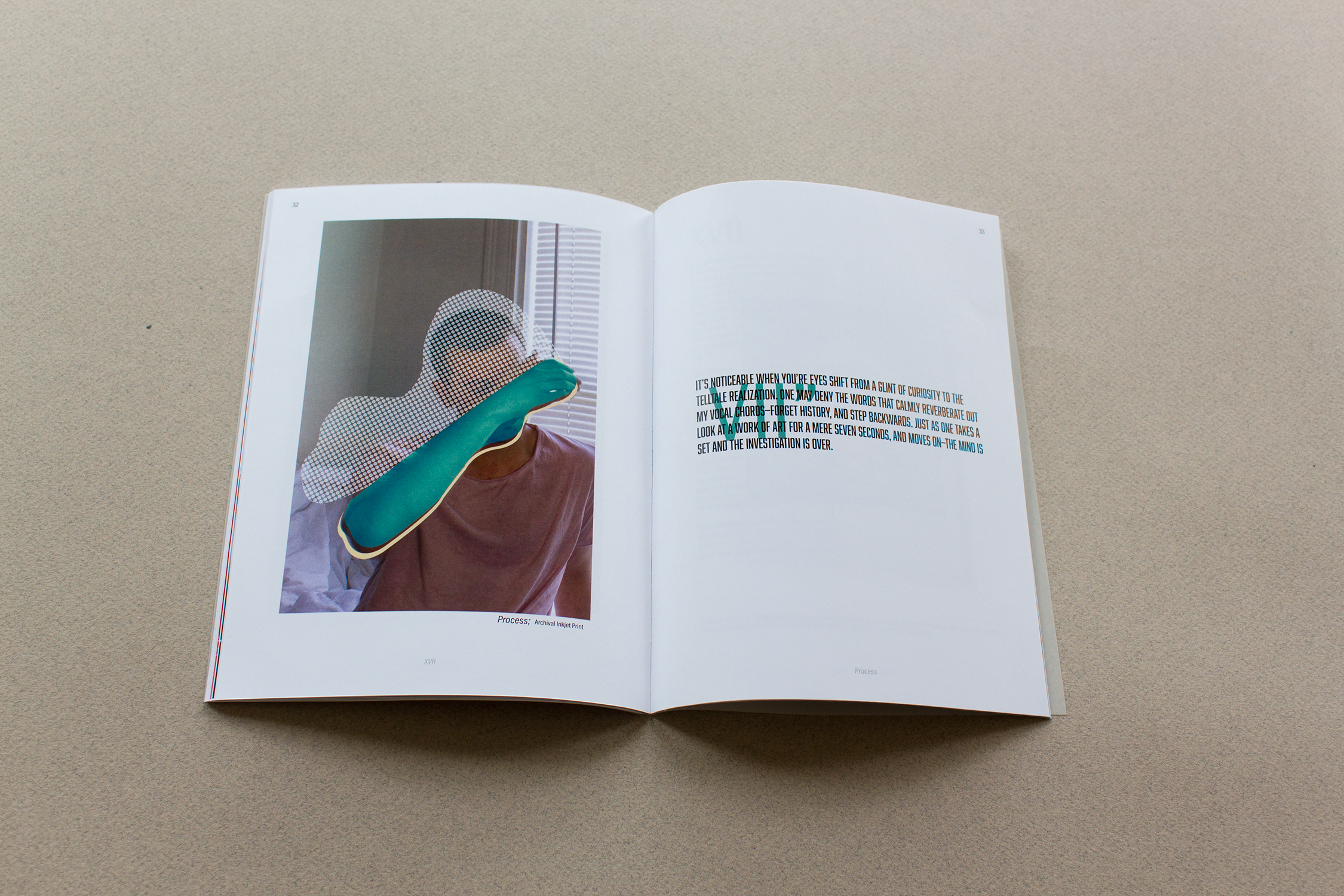
I utilized photographs I’d taken within the metals shop at my undergraduate school, to include process photos of fabrication with metal.
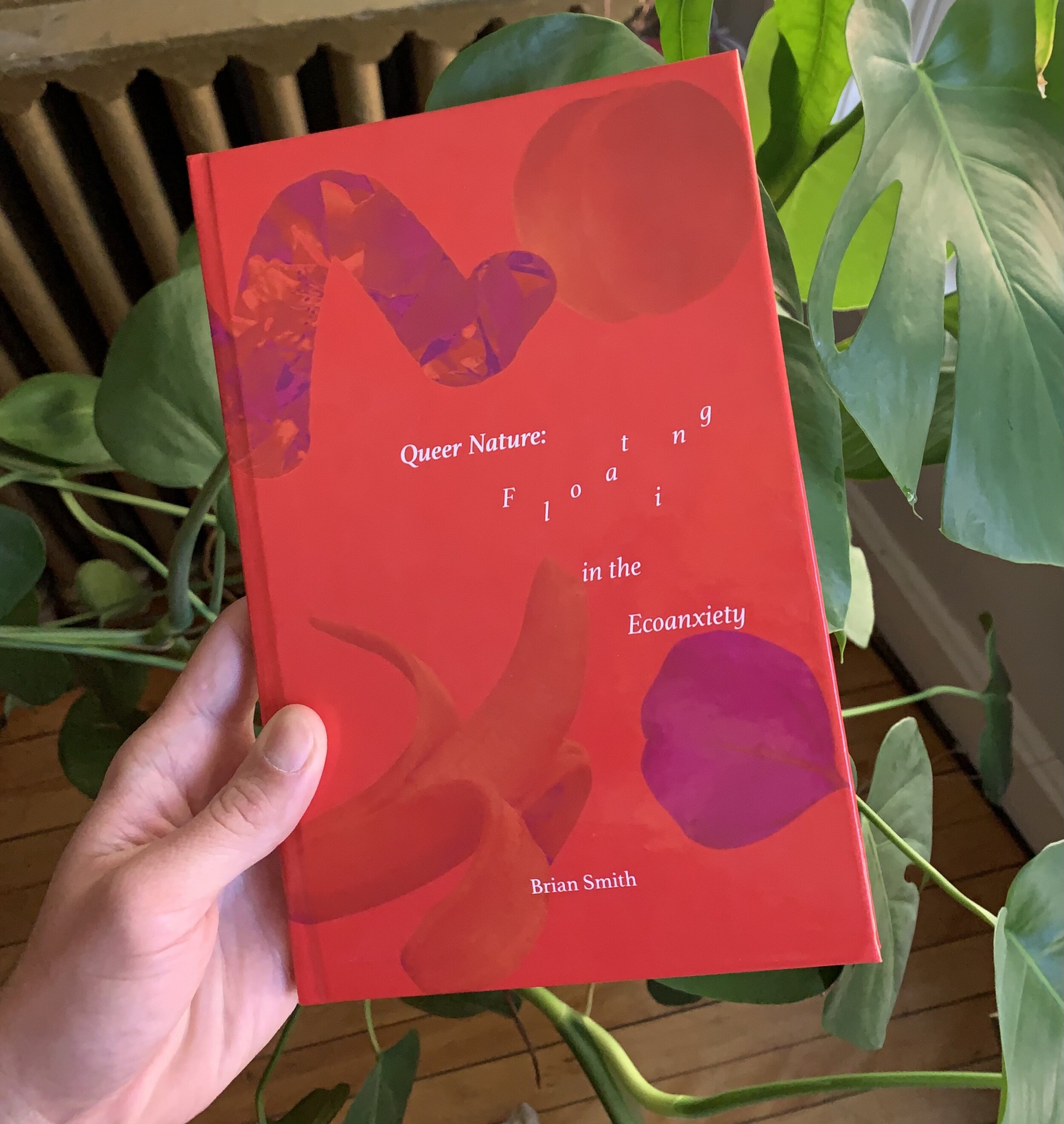
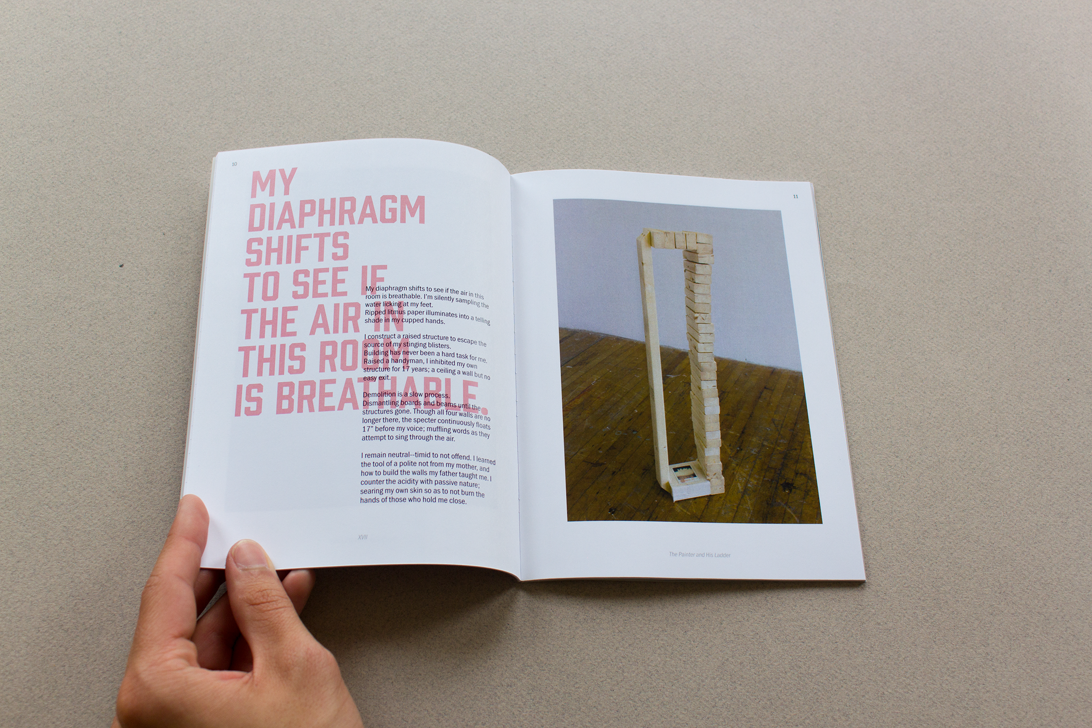
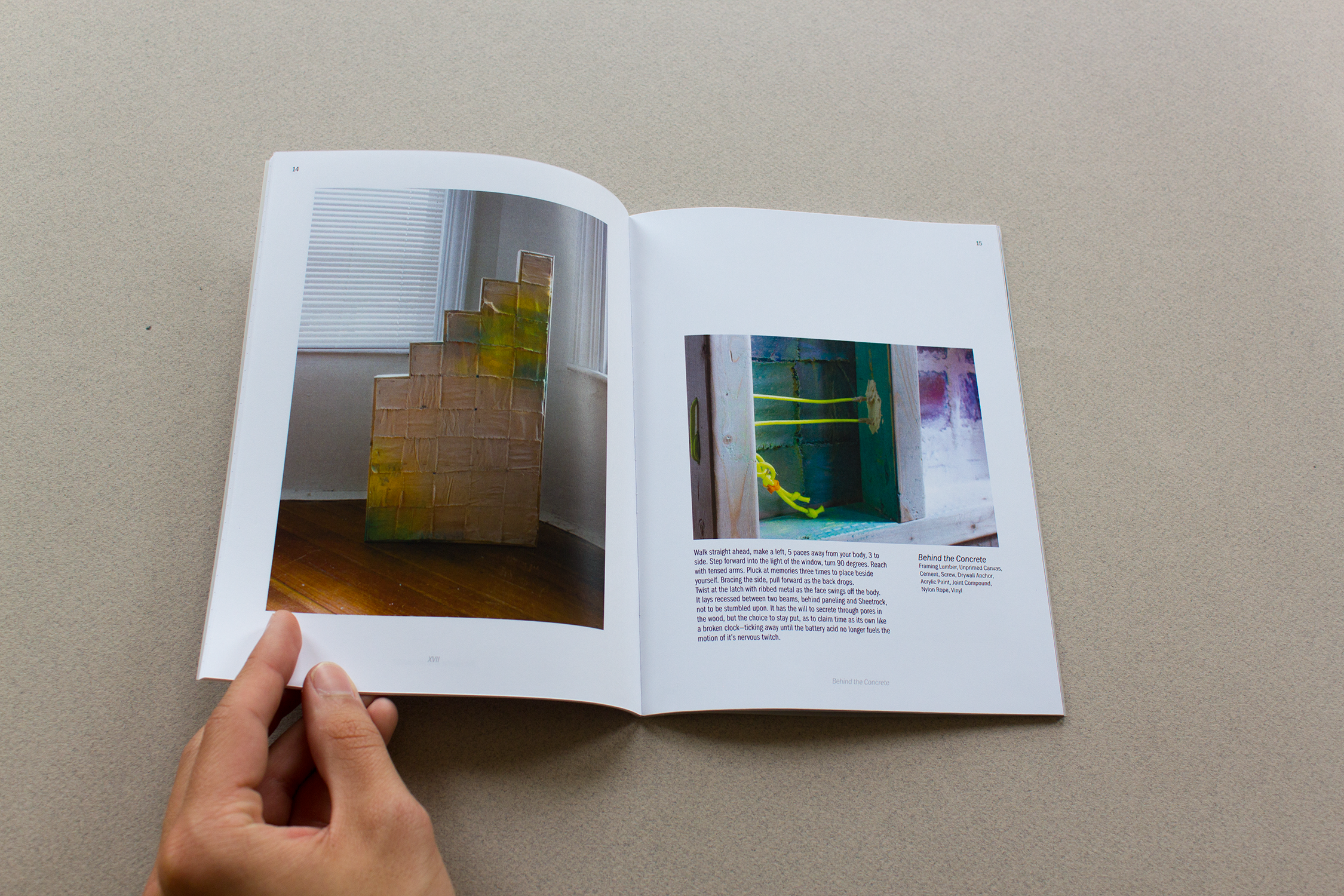
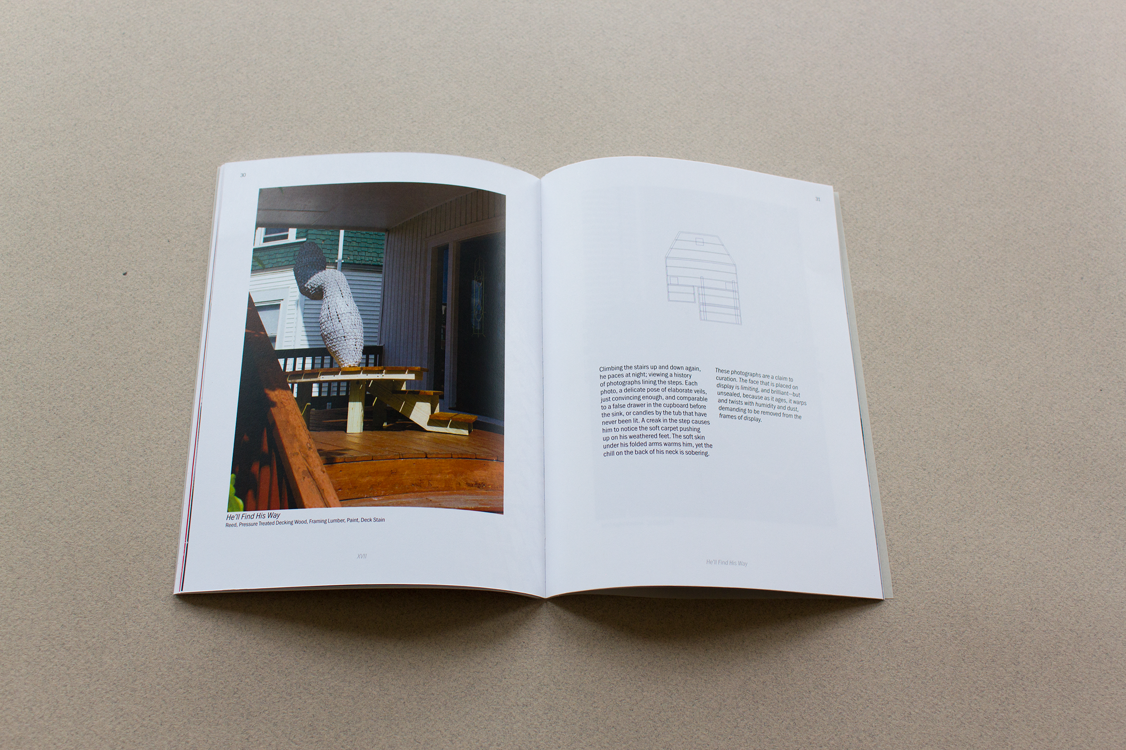
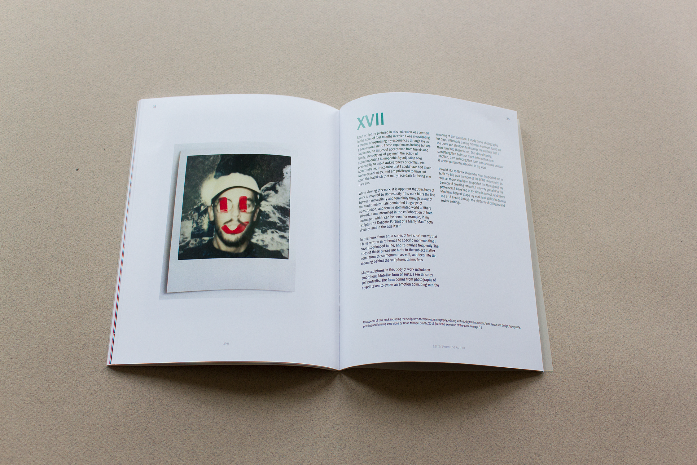
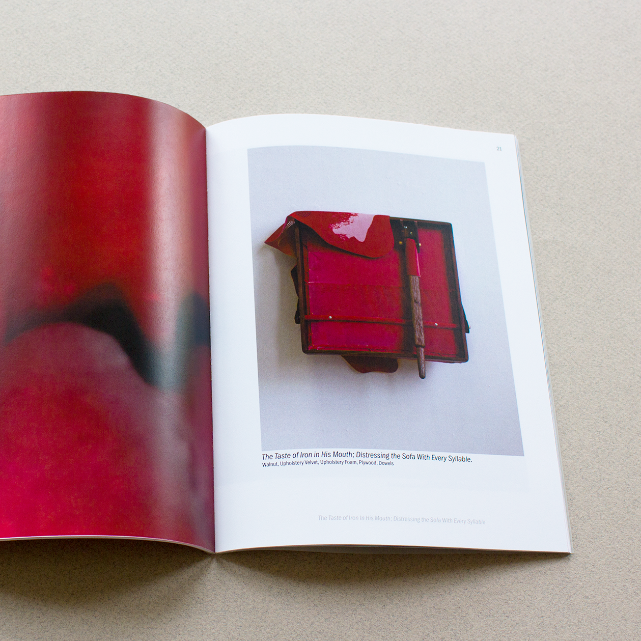
This body of work was created over a concentrated period of exploration, using sculpture to reflect on my positionality and personal experiences. The pieces are autobiographical in nature, addressing themes of identity, self-perception, and the ways we navigate social expectations.
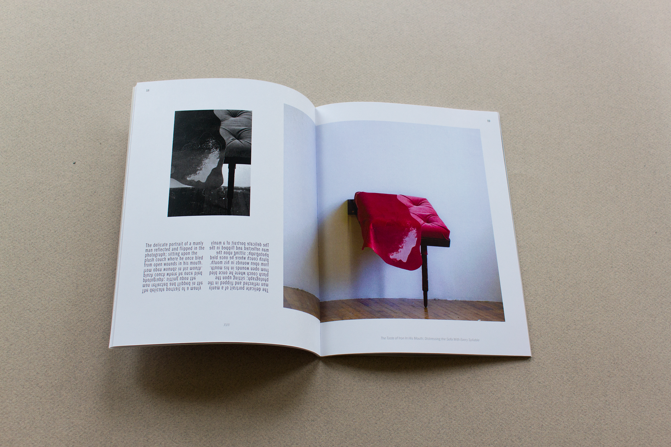
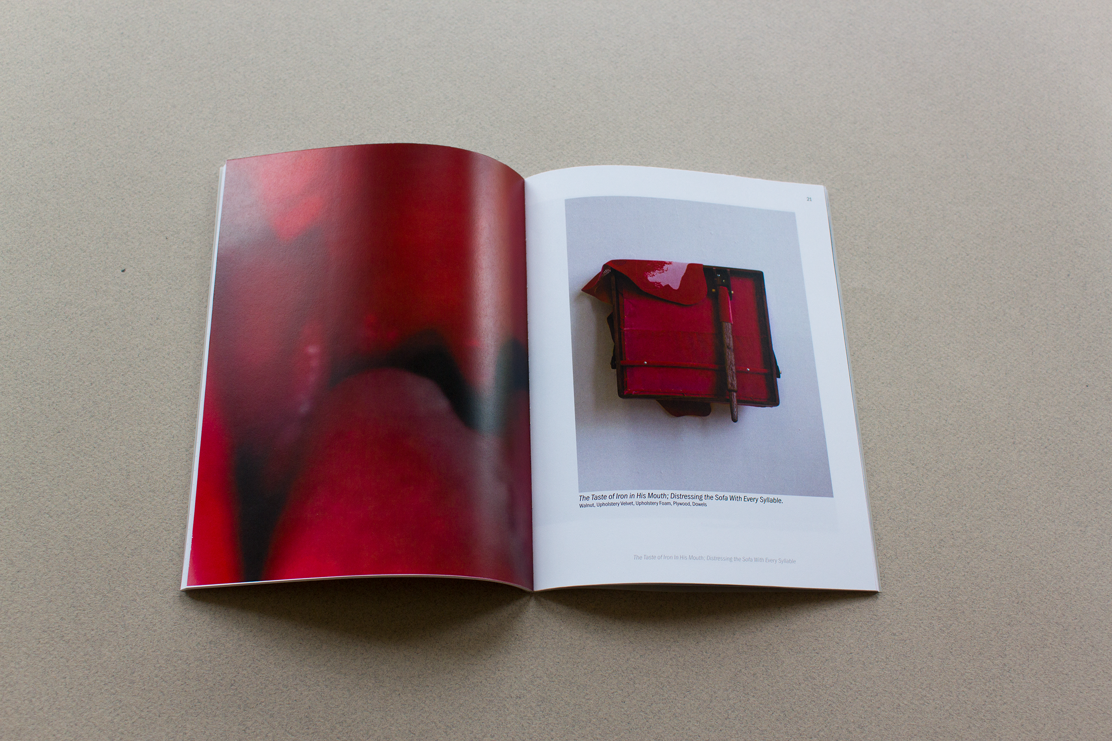
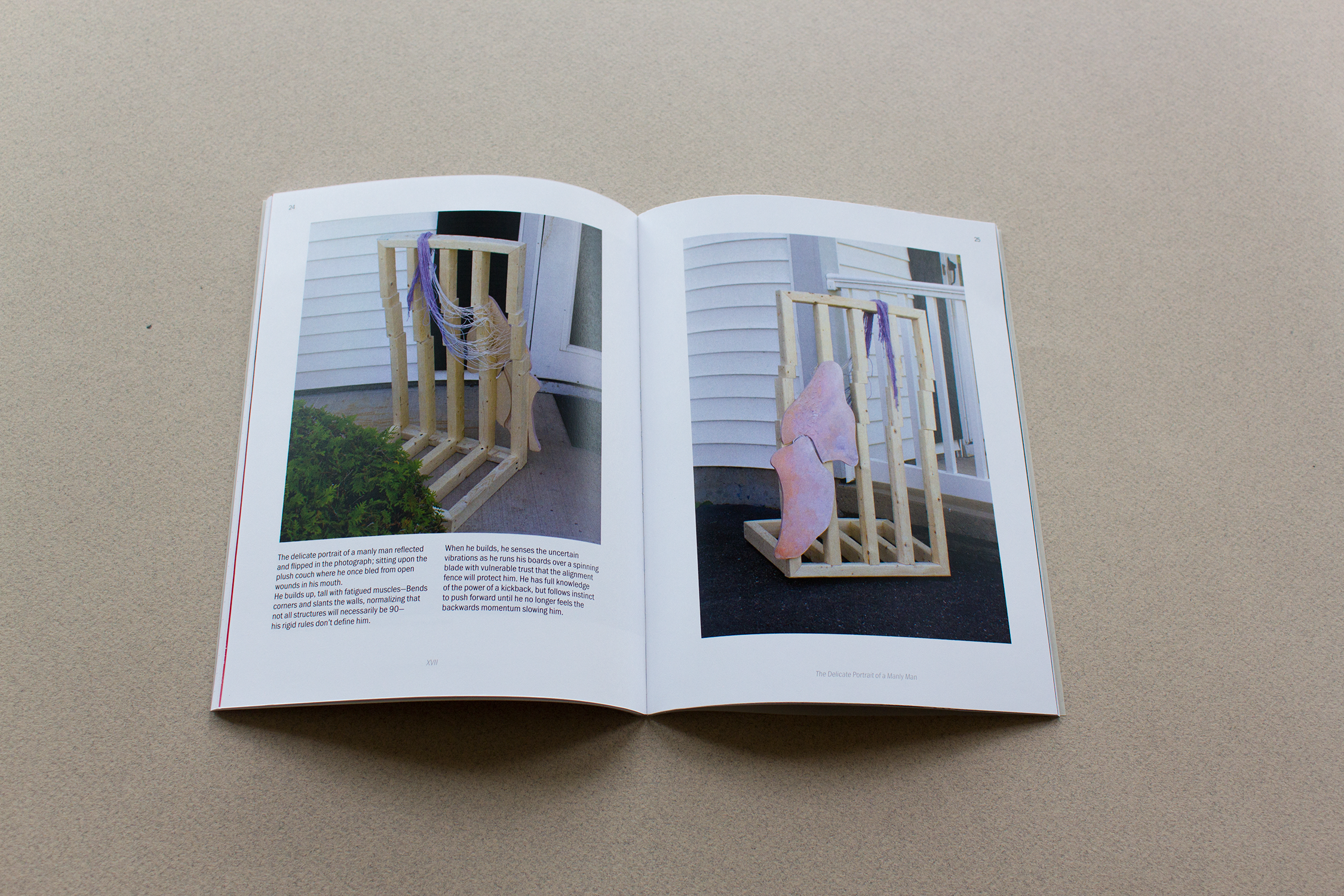
Many works draw on domesticity and the overlap of traditionally gendered languages — the structured world of construction and the tactile world of fiber arts. I’m interested in how these materials and methods can intersect, creating dialogue between form, process, and meaning. Pieces like A Delicate Portrait of a Manly Man embody this interplay, both visually and conceptually.
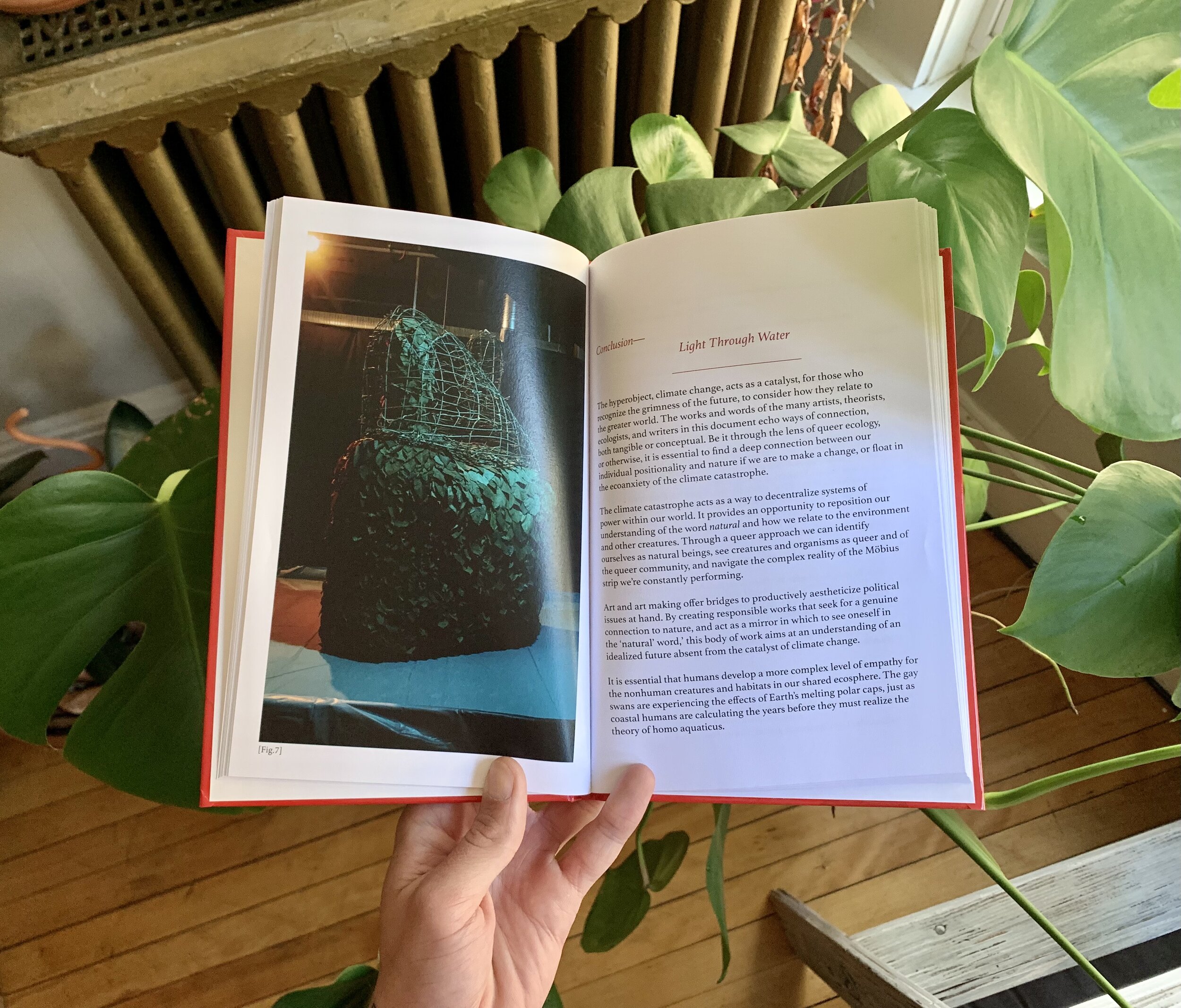
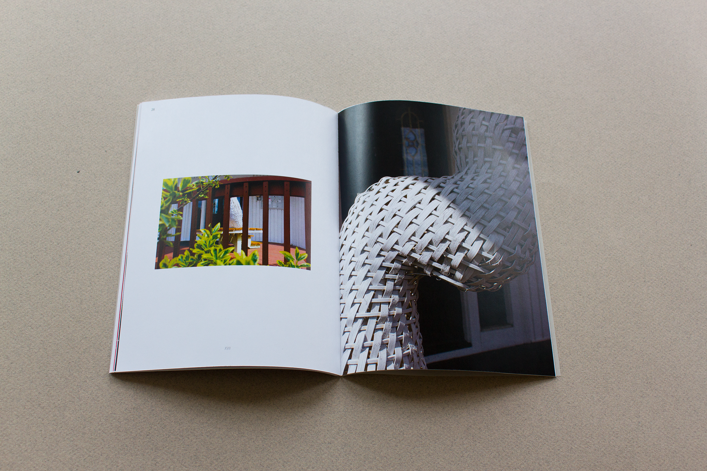
Several sculptures feature amorphous, abstract forms that act as self-portraits. These forms originate from photographs and observations of myself, simplified into contours that capture emotion and presence. The act of distilling complex experience into shape is a central part of my practice.
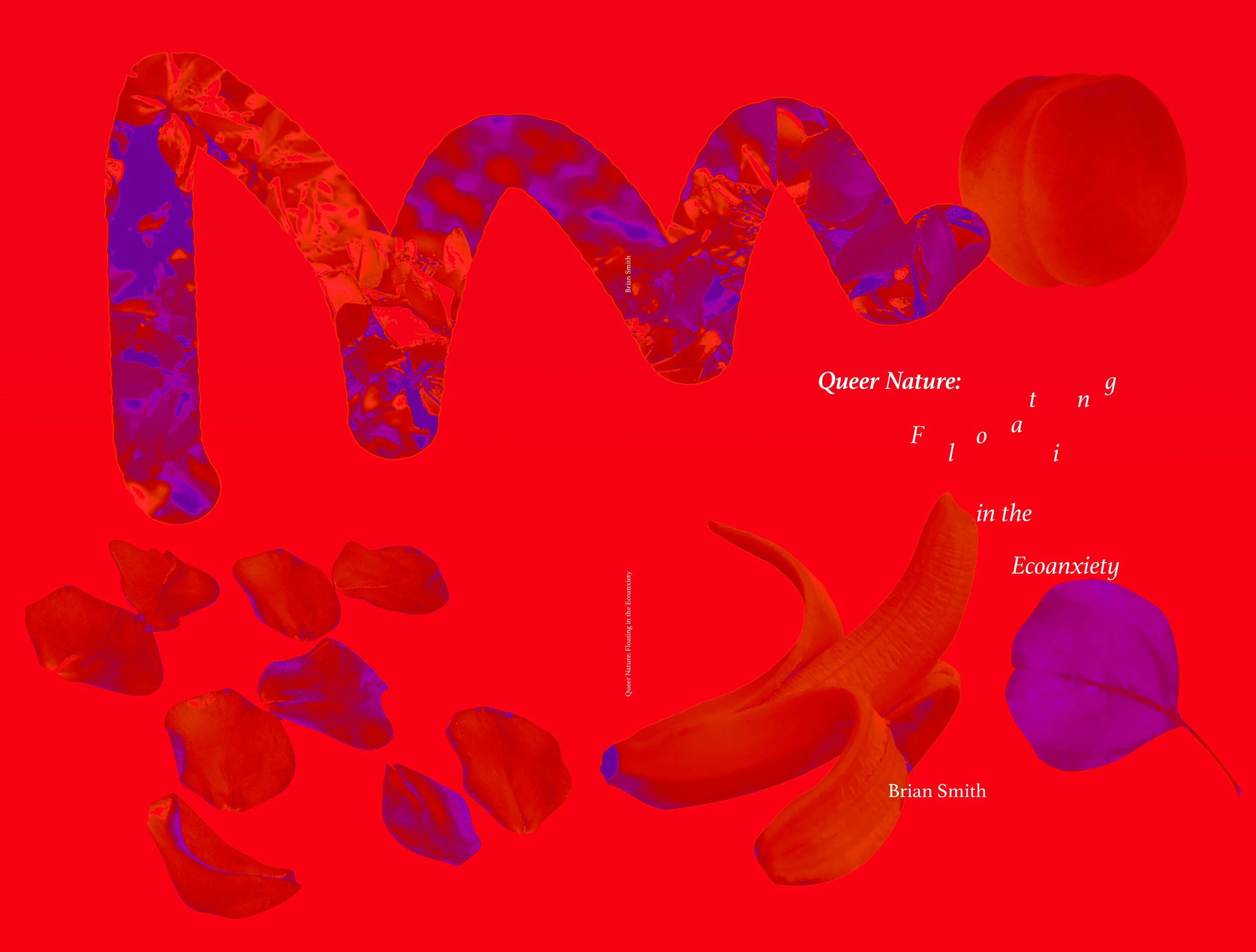
The book itself is designed as an extension of this process. Every element — photography, layout, typography, and sequencing — was approached experimentally, reflecting the exploratory energy of the sculptures. The design balances narrative and visual rhythm, creating a space where text, image, and form interact, much like the work it presents. Short poems and texts woven throughout the book echo this approach, responding to the same themes and creating layered connections between language and object.
This project is fully self-produced — from sculpture to photography, editing, layout, and production — reflecting my hands-on approach and commitment to seeing ideas through every stage of creation.